Introduction
Introduction.RmdOverview
Author: Yong-Han Hank Cheng
This package allows you to generate and compare power spectral density (PSD) plots given time series data. FFT is used to take a time series data, analyze the oscillations, and then output the frequencies of these oscillations in the time series in the form of a PSD plot.
Installation
# Install the package from GitHub
# devtools::install_github("yhhc2/psdr")
# Load package
library("psdr")
Example
Below is an example of how this package can be used to take a dataframe with multiple separate time series belonging to 2 categories (A and B), separate out the time series, and use the time series to make PSDs and compare the dominant frequencies between the two categories of signals.
Load in example dataset
In this example dataset, there are 3 time series for each category. 3 for category A and 3 for category B. Each time series comes from one session, so there are 6 sessions in total. For each signal, the sampling rate is 100 Hz, which means a data point is obtained every 0.01 seconds.
example_data <- GenerateExampleData()

example_data_displayed <- example_data

colnames(example_data_displayed) <- c("Time in seconds", "Signal", "Session", "Category")

head(example_data_displayed)
## Time in seconds Signal Session Category
## 1 0 0.0000000 1 A
## 2 0.01 0.1255810 1 A
## 3 0.02 0.2506665 1 A
## 4 0.03 0.3747626 1 A
## 5 0.04 0.4973798 1 A
## 6 0.05 0.6180340 1 A
#Only works in html, not md.
rmarkdown::paged_table(example_data_displayed)
Here is how the package can be used to take a dataframe containing data from all 6 sessions and split it into multiple dataframes, with each dataframe containing data from a single session.
example_data_windows <- GetHomogeneousWindows(example_data, "Session", c("Session"))Explore the dataset
Plotting all the time series for category A on a single plot and plotting time series data for category B on a single plot shows that the frequencies of signals in category A are higher.
Plot signals for category A
plot_result <- ggplot2::ggplot(subset(example_data, example_data$Category=="A"), ggplot2::aes(x = Time, y = Signal, colour = Session, group = 1)) + ggplot2::geom_line()

plot_result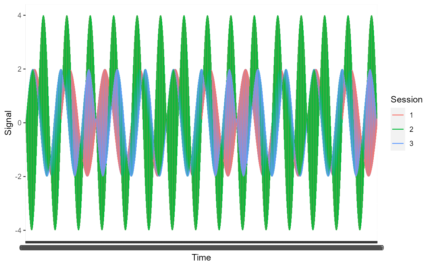
Plot signals for category B
plot_result <- ggplot2::ggplot(subset(example_data, example_data$Category=="B"), ggplot2::aes(x = Time, y = Signal, colour = Session, group = 1)) + ggplot2::geom_line()

plot_result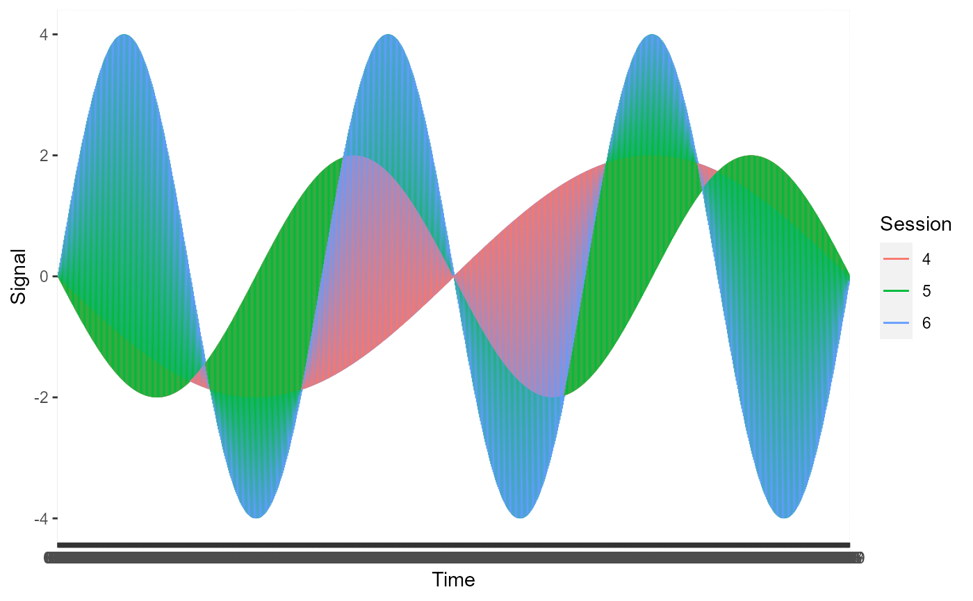
This remains true when the time series for each category are averaged.
FirstComboToUse <- list( c(1, 2, 3), c("A") )

SecondComboToUse <- list( c(4, 5, 6), c("B") )

timeseries.results <- AutomatedCompositePlotting(list.of.windows = example_data_windows,
                           name.of.col.containing.time.series = "Signal",
                           x_start = 0,
                           x_end = 999,
                           x_increment = 1,
                           level1.column.name = "Session",
                           level2.column.name = "Category",
                           level.combinations = list(FirstComboToUse, SecondComboToUse),
                           level.combinations.labels = c("A", "B"),
                           plot.title = "Comparing category A and B",
                           plot.xlab = "Time in 0.01 second increments",
                           plot.ylab = "Original units of signal",
                           combination.index.for.envelope = NULL,
                           TimeSeries.PSD.LogPSD = "TimeSeries",
                           sampling_frequency = NULL)

ggplot.obj.timeseries <- timeseries.results[[2]]

ggplot.obj.timeseries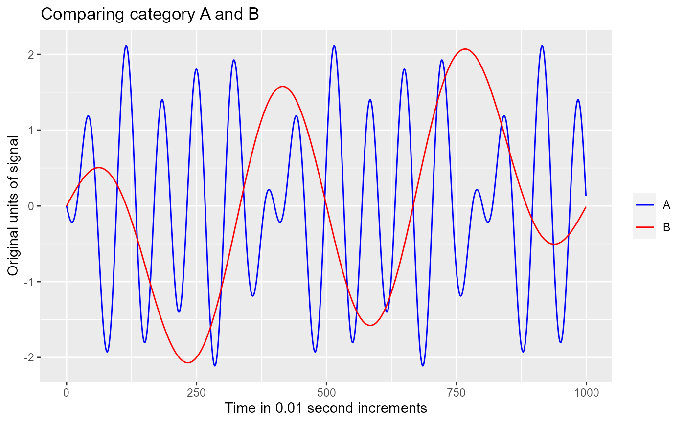
Visualize the frequency contribution of signals
Looking at the time series data, we can tell the frequencies of oscillations are different between the time series. To determine which frequencies are contributing to each time series, we can plot the PSDs for each time series.
PSD for signals in category A
data1 <- example_data_windows[[1]]
psd_results1 <- MakePowerSpectralDensity(100, data1$Signal)

data2 <- example_data_windows[[2]]
psd_results2 <- MakePowerSpectralDensity(100, data2$Signal)

data3 <- example_data_windows[[3]]
psd_results3 <- MakePowerSpectralDensity(100, data3$Signal)

Frequency <- c(psd_results1[[1]], psd_results2[[1]], psd_results3[[1]])
PSD <- c(psd_results1[[2]], psd_results2[[2]], psd_results3[[2]])
Session <- c(rep(1, length(psd_results1[[1]])), rep(2, length(psd_results1[[1]])),
             rep(3, length(psd_results1[[1]])))

data_to_plot <- data.frame(Frequency, PSD, Session)

plot_results <- ggplot2::ggplot(data=data_to_plot, ggplot2::aes(x=Frequency, y=PSD, color = as.factor(Session), group=1)) +
  ggplot2::geom_point() + ggplot2::geom_path() + ggplot2::xlim(0,3)

plot_results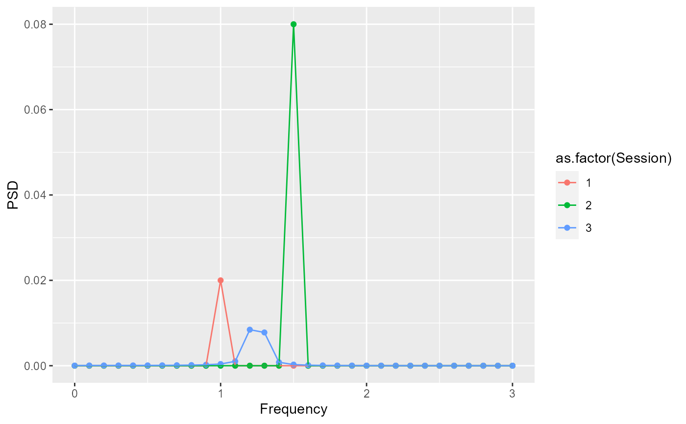
PSD for signal in category B
data1 <- example_data_windows[[4]]
psd_results1 <- MakePowerSpectralDensity(100, data1$Signal)

data2 <- example_data_windows[[5]]
psd_results2 <- MakePowerSpectralDensity(100, data2$Signal)

data3 <- example_data_windows[[6]]
psd_results3 <- MakePowerSpectralDensity(100, data3$Signal)

Frequency <- c(psd_results1[[1]], psd_results2[[1]], psd_results3[[1]])
PSD <- c(psd_results1[[2]], psd_results2[[2]], psd_results3[[2]])
Session <- c(rep(4, length(psd_results1[[1]])), rep(5, length(psd_results1[[1]])),
             rep(6, length(psd_results1[[1]])))

data_to_plot <- data.frame(Frequency, PSD, Session)

plot_results <- ggplot2::ggplot(data=data_to_plot, ggplot2::aes(x=Frequency, y=PSD, color = as.factor(Session), group=1)) +
  ggplot2::geom_point() + ggplot2::geom_path() + ggplot2::xlim(0,3)

plot_results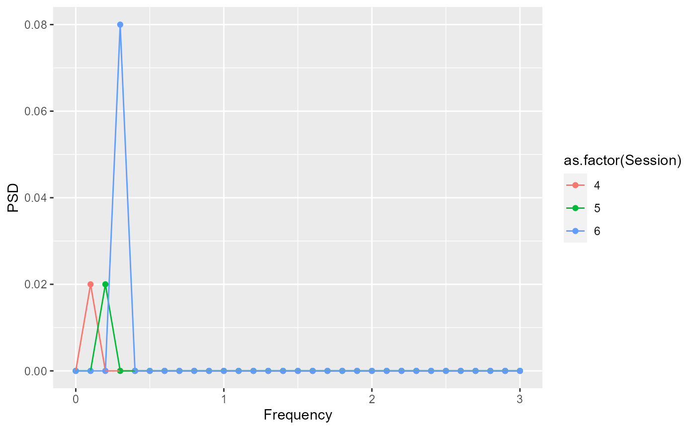
To get a single composite PSD for each category, we can take the average.
FirstComboToUse <- list( c(1, 2, 3), c("A") )

SecondComboToUse <- list( c(4, 5, 6), c("B") )

PSD.results <- AutomatedCompositePlotting(list.of.windows = example_data_windows,
                           name.of.col.containing.time.series = "Signal",
                           x_start = 0,
                           x_end = 5,
                           x_increment = 0.01,
                           level1.column.name = "Session",
                           level2.column.name = "Category",
                           level.combinations = list(FirstComboToUse, SecondComboToUse),
                           level.combinations.labels = c("A", "B"),
                           plot.title = "Comparing category A and B",
                           plot.xlab = "Hz",
                           plot.ylab = "(Original units)^2/Hz",
                           combination.index.for.envelope = NULL,
                           TimeSeries.PSD.LogPSD = "PSD",
                           sampling_frequency = 100)

ggplot.obj.PSD <- PSD.results[[2]]

ggplot.obj.PSD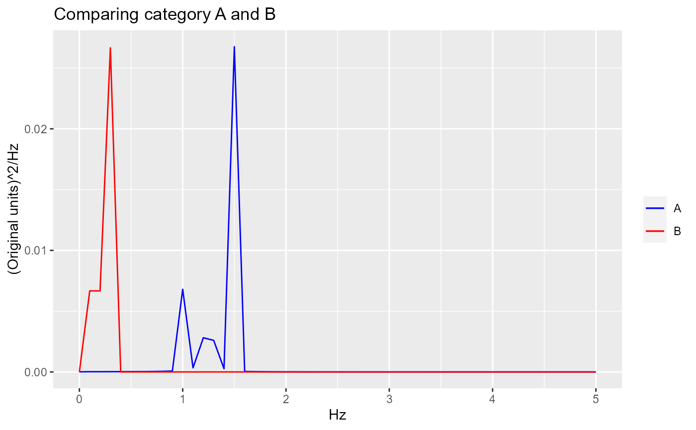
If we want to see how the average compares to the individual signals that make up the average, then we can include an error envelope.
Here is the error envelope added to the category A composite curve.
PSD.results <- AutomatedCompositePlotting(list.of.windows = example_data_windows,
                           name.of.col.containing.time.series = "Signal",
                           x_start = 0,
                           x_end = 5,
                           x_increment = 0.01,
                           level1.column.name = "Session",
                           level2.column.name = "Category",
                           level.combinations = list(FirstComboToUse, SecondComboToUse),
                           level.combinations.labels = c("A", "B"),
                           plot.title = "Comparing category A and B",
                           plot.xlab = "Hz",
                           plot.ylab = "(Original units)^2/Hz",
                           combination.index.for.envelope = 1,
                           TimeSeries.PSD.LogPSD = "PSD",
                           sampling_frequency = 100
                           )

ggplot.obj.PSD <- PSD.results[[2]]

ggplot.obj.PSD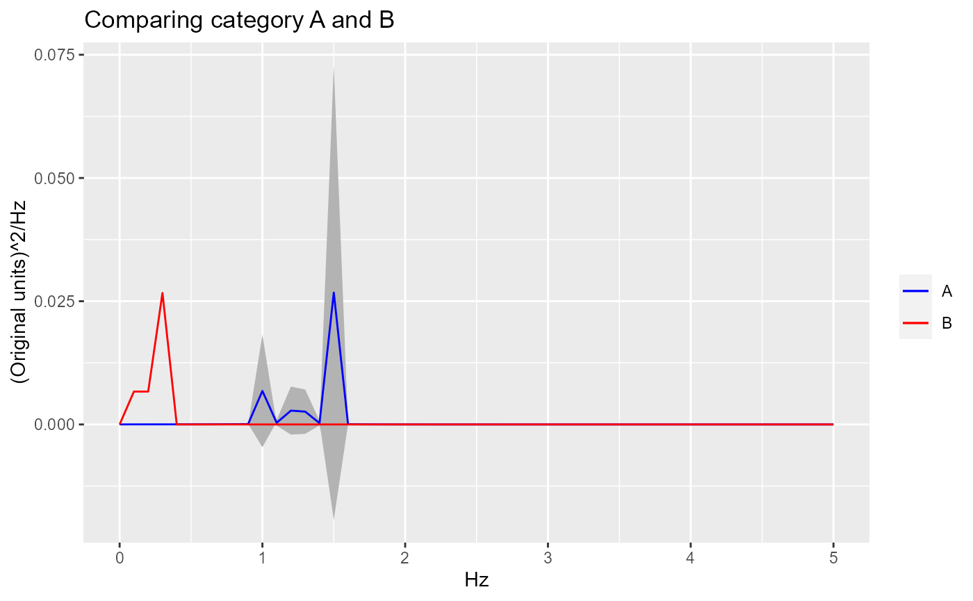
Here is the error envelope added to the category B composite curve.
PSD.results <- AutomatedCompositePlotting(list.of.windows = example_data_windows,
                           name.of.col.containing.time.series = "Signal",
                           x_start = 0,
                           x_end = 5,
                           x_increment = 0.01,
                           level1.column.name = "Session",
                           level2.column.name = "Category",
                           level.combinations = list(FirstComboToUse, SecondComboToUse),
                           level.combinations.labels = c("A", "B"),
                           plot.title = "Comparing category A and B",
                           plot.xlab = "Hz",
                           plot.ylab = "(Original units)^2/Hz",
                           combination.index.for.envelope = 2,
                           TimeSeries.PSD.LogPSD = "PSD",
                           sampling_frequency = 100
                           )

ggplot.obj.PSD <- PSD.results[[2]]

ggplot.obj.PSD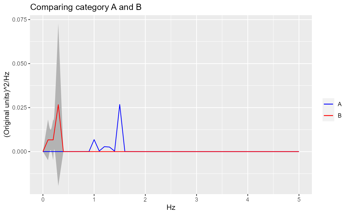
When the signals are very noisy, it is often times helpful to log transform the PSD plots. For the example data, this is not necessary because the signals are very clear. Since amplitudes are small, log transform are also not helpful here.
LogPSD.results <- AutomatedCompositePlotting(list.of.windows = example_data_windows,
                           name.of.col.containing.time.series = "Signal",
                           x_start = 0,
                           x_end = 5,
                           x_increment = 0.01,
                           level1.column.name = "Session",
                           level2.column.name = "Category",
                           level.combinations = list(FirstComboToUse, SecondComboToUse),
                           level.combinations.labels = c("A", "B"),
                           plot.title = "Comparing category A and B",
                           plot.xlab = "Hz",
                           plot.ylab = "Log((Original units)^2/Hz)",
                           combination.index.for.envelope = NULL,
                           TimeSeries.PSD.LogPSD = "LogPSD",
                           sampling_frequency = 100
                           )

ggplot.obj.LogPSD <- LogPSD.results[[2]]

ggplot.obj.LogPSD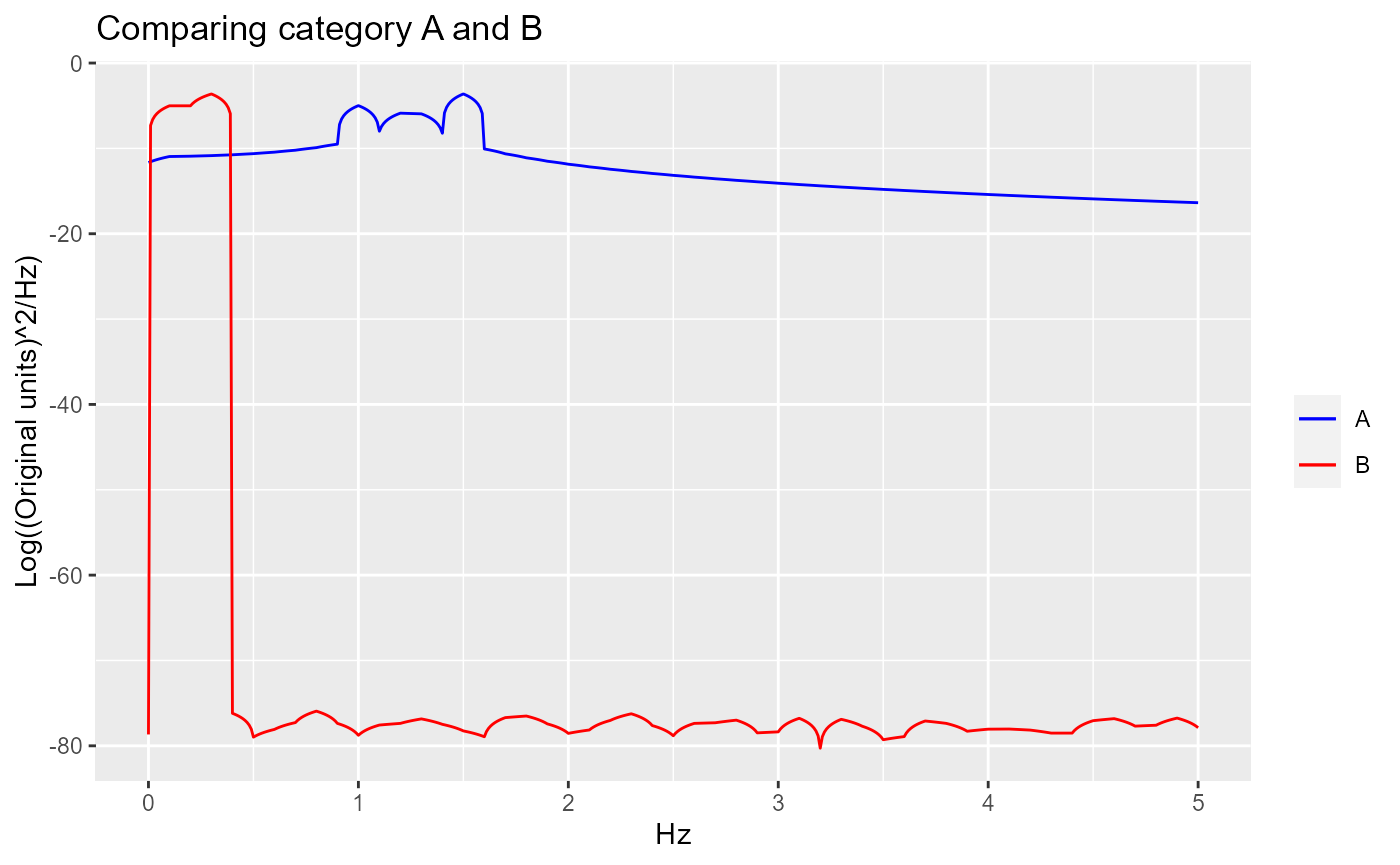
Comparing frequency contribution of each category
We know there are differences in frequencies of signals between category A and B, but we want to statistically test if the difference is significant.
comparison_results <- PSD.results[[3]]

dominant_freq_for_comparison <- comparison_results[[1]]

kruskal_wallis_test_results <- comparison_results[[2]]

wilcoxon_rank_sum_test_results <- comparison_results[[3]]
Since multiple signals are present in each category, we want to see if the dominant frequencies in signals of category A are significantly different from the dominant frequencies in signals of category B
dominant_freq_for_comparison## vals.to.compare.combined combo.labels.combined
## 1 1.0 A
## 2 1.5 A
## 3 1.2 A
## 4 0.1 B
## 5 0.2 B
## 6 0.3 BThe comparison can be performed using the Kruskal-Wallis rank sum test. Here, the p-value indicates the difference is statistically significant.
kruskal_wallis_test_results##
## Kruskal-Wallis rank sum test
##
## data: vals.to.compare.combined by combo.labels.combined
## Kruskal-Wallis chi-squared = 3.8571, df = 1, p-value = 0.04953In this example, only two categories are used. However, Kruskal-Wallis rank sum test can be used for multiple categories, similar to ANOVA. If more than two categories are used, pair-wise testing using Wilcoxon rank sum exact test can be used to see which two categories are significantly different.
wilcoxon_rank_sum_test_results##
## Pairwise comparisons using Wilcoxon rank sum exact test
##
## data: vals.to.compare.with.combo.labels$vals.to.compare.combined and vals.to.compare.with.combo.labels$combo.labels.combined
##
## A
## B 0.1
##
## P value adjustment method: BH